
Beyond Resizing: The Image Performance Checklist
This is the talk that I gave at ImageCon 2018, then followed up with an encore at the San Francisco Web Performance Meetup. The slides here are from the second performance.
You can watch my the ImageCon performance, if video is your thing.
You can also download a PDF of the ImageCon slides, if you'd like, though this presentation is more meaningful with the transcript.
This presentation is WHAT to do. You'll be able to download the HOW-TO guide shortly.

Hi! I am so excited to be here this morning! This is the happy-feel-good talk because the fact that you are here means that you care about images and performance, and I'm glad you're here!

One of the best things about being the first non-keynote speaker is that I get to help all the other speakers by figuring out some things about all of you.

Like, how many people self-label themselves as the software people?
"Developers."

How many are designers?
Dev Ops?

How many are with a small company? Your definition of small.
Medium?
Large?
Awesome! This helps!

So, imagine I'm a front-end engineer. You don't have to imagine hard, I am.
I've been tasked with making my company's website more performant. I know "Performance is everybody's problem," so I roll up my sleeves and get started.

Now imagine I’m a back-end developer. Again, not difficult, I am.
I am been tasked with making my company's website more performant. "Everybody's problem, eh?" Okay, let me help.

Now, what if I'm in dev ops, doing network engineering and system administration and occasionally deployments. I've been tasked with making my company's website more performant.
To which I say, "Wait, I am?"
And of course I am, it’s everyone’s problem, so let's do this.

None of these overlapping roles are independent of the other when it comes to website and application performance. They are all intertwined, each can undo or enhance the work of another group.
Being aware of performance bottle necks among these three roles can improve a company or consultant's ability to improve website performance.
Image credit: Teamwork by Jeff Sandquist - https://www.flickr.com/photos/jeffsand/1138456027/i

How many here already resize their images, delivering different image sizes based on the device or viewport of the client?
At the conference, about 25% of the attendees raised their hands.
If you didn't raise your hand here, I'm guessing you've either fallen asleep or are distracted by the person next to you.

For the former, there's coffee around here somewhere.

Beyond resizing, we have a large number of techniques and technologies we can use to deliver and render images faster.

Knowing where to start is sometimes difficult with all the different resources, lists, and suggestions available ...
... and knowing when we’ve done enough is also sometimes difficult, knowing when to say, okay, good enough, move on, prioritize something else.
So, let's give this a shot, let's create the "I'm already resizing images, what should I do next?" list for increasing website performance - images in particular.

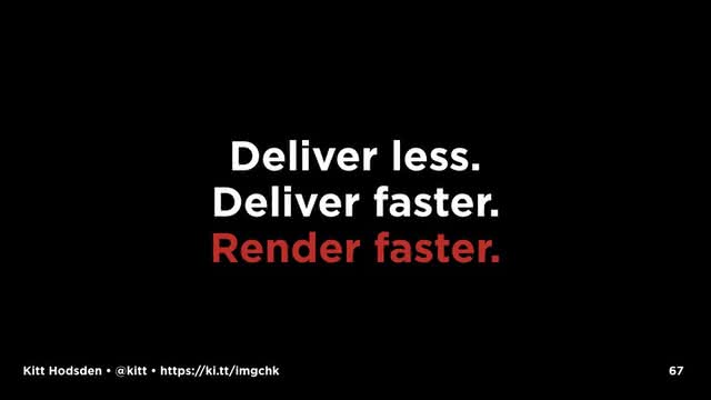
Our goals for this task are ...

1. Deliver less content
2. Deliver the content faster
3. And render the content faster.
Deliver only what you need, when you need it, as fast as you can, then display it quickly.
At the risk of expressing a controversial opinion, I'd like to suggest “Be Like AMP” be on our goals, too.
Let me explain.
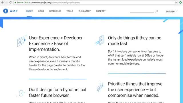
If you’re not familiar with AMP, the acronym stands for Accelerated Mobile Pages, it’s an open-source project aimed at allowing mobile website content to render nearly instantly. This initiative was started by Google, and isn’t really independent of Google, but It is s supported by a few other big sites: Bing, Twitter, Pinterest, and a few others.
Its priorities are user experience, build for what exists now, don't break the web, make it fast, and don't exclude anyone.
I just love these guiding principles. They are great!

And while one could argue Google's motivation and dominance in the space, the AMP project goals are close to our performance goals, so including it and its guiding principles in our goals is a good thing.
“Be like AMP” with us means “Be inspired by the good parts of AMP!"

So let’s do this!
But wait.
Image credit: Ants by Luigi Mengato - https://www.flickr.com/photos/luigimengato/7866196508/

Before we can confirm we are doing "less" ...

and "faster" effectively, we need two bits of information:
1. Who is our audience?
You find this out with site analytics.

2. What is our current performance baseline?
With this information, we can know that the changes we make are effective. And if they aren't, we can undo the changes, because we know what we did.
Image credit: Baseline by Chuck Coker - https://www.flickr.com/photos/caveman_92223/3279909967/

So, another quick checkin for you, who here uses a web performance tool?
I'm talking WebPageTest, Sitespeed, Lighthouse, Dev Tools ...
It's okay if you don't know.
At ImageCon, about 10% of the audience raised their hands.
Of the tools I mentioned, dev tools is the easiest.
We can see how fast our website is by opening up our browser developer tools, opening up the network tab, clearing our caches, and reloading the page.
This first order approximation of our site size and loading time is GREAT. It is easy to use, easily available, a reasonable first pass, and relatively ineffective for tracking values over time or sharing data.
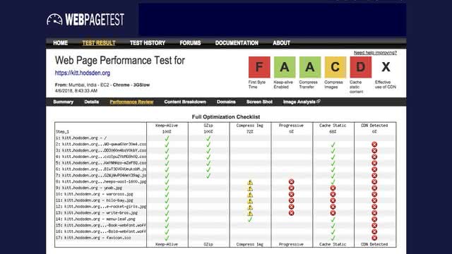
Which is why using web performance measurement tools is important.
I love, love, love WebPageTest and the like ...
... because using web performance tools like WebPageTest means you can share your data, save your data, and see trends over time.
A few suggestions for these tools.

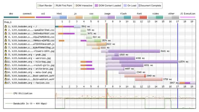
1. Track more than just the front page.
While the front page is important, and optimizing it is also important, I strongly recommend viewing multiple pages on your site, and looking at a good sampling of all the different site views such as the single article page, listing pages, account pages, summary pages, the heaviest page you have, the one that you know takes the longest to load, and the most viewed page type.
2. Run your tests on an older mobile device, with a slow 3G connection.
You'll have the benefit of both solving for a difficult case (say, when the CEO is somewhere nearly offgrid and trying to view the site with an Edge connection), and understanding where the bottlenecks are in your site, as the slower CPU and slower network will exaggerate them.

3. Run each test multiple times.
A single run may give you a fast or slow outlier. Faster than normal, and you might think you're done, when you aren't. Slower than normal and you might work to optimize a rare case.
4. Automate the process
Don't have manually triggered one-off checks.
Do have the performance test process as part of the check in or deployment process.
Do have it scheduled to run daily or more frequently. Have the tools send you a report in the morning!
Don't do this manually (except when checking something specific), because it won't be done until a performance-destroying change happens and everyone, including your users, notice the performance degradation.
Do it regularly so that you know what's going on.
If you haven’t done the automating part, this is one of my favorite tech tasks to do. Let’s talk.
Okay, so we have “less” and “faster” defined. The basics of image performance!

This is the big one.
Resize your images.

If you are already doing this, thank you. You are already making the Internet a better place.
Image credit: Awesome by Selena N. B. H. - https://www.flickr.com/photos/moonlightbulb/3338852116/

Make it easy to resize images. If things are not easy, they won't be done, that's human nature.
What do I mean by this?
We can have our developers use photoshop to handcraft a resized image.
Or we can use some third-party website to generate different sizes, then upload them to another website optimizer.
Both of these take someone's time and effort.
Better, we can have a script that runs locally, manually triggered, that resizes our images. Run it and let it go.
Or, even better, we can have a process that resizes our images when any image is added to a folder.
Best, we can resize our images in production, it Just Happens™. This makes resizing easy for the developers and designers.

After resizing, we still aren't done with the basics. Choosing the right image format and compressing (optimizing) the images will also make them smaller and deliver faster since we have less to send over.
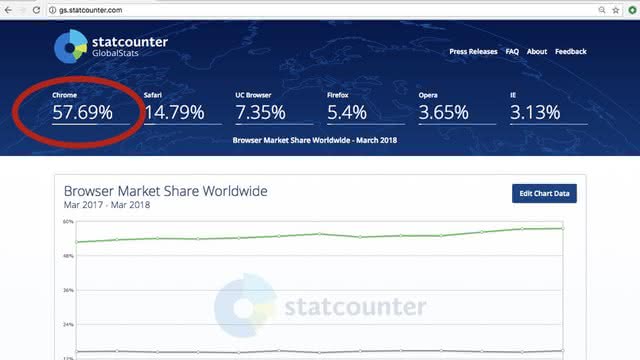
For example, if you have a completely average site, and you know this because you are tracking who your customers are, you'll have nearly 60% of your traffic is sent to a Chrome browser.
As such, sending webp images instead of JPG images would be wise.

Some general guidelines:
If it's a photo, use WEBP and JPEG.
If it's in a vector format, or can become one, use SVG.
If you want to have an animated GIF, use SVG if you can, MP4 and WEBM if you can't.
Use PNG for everything else, unless another format is smaller.
Those are just general guidelines.

What we want is the smallest image we can make, so we want to use the file format that gives us the smallest image.
What about other image formats and the less-general cases we have heard about?

What about the High Efficiency Image Format from Apple and the MPEG working group?
(How is this pronounced? heeeeeeef? hi-if? heff? I kinda wonder if we’ll have another GIF/JIF war with this one.)
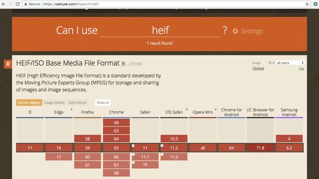
Regardless of pronunciation, this format is not available for use on the web.
These new formats from the MPEG working group and Apple are fantastic for source images, but not for the web where small and “sufficient” is good enough and desired in many cases.

And PNGs, let's talk about PNGs.
PNGs are great, but can also bloat. PNGs have an alpha channel so you can have transparency, but imagine the case where you want a small bit of transparency, say, a rounded corner on an image, and the rest of the image is full photograph? Do that, and you'll have a large file, maybe larger than a GIF file could be.
And we have PNG8 and PNG24 and PNG32 and PNG48. We have lossless and lossy versions, and alpha channels.
Ugh!
Throw away as much as you can. Smallest file. You don't need that extra color depth on your PNG file, go PNG8. "Good enough." Link to the larger image if you need a better picture.

And GIF? For the most part, no.
Worth checking, though! A black and white image or all gray scale might be smaller than a PNG or even JPG!
For animated gifs, use mp4

And sprites? Remember image sprites?
They are still useful, depending on the number of images! Often times we can overlook older solutions in favor of the NEW and EXCITING, and sprites are one of these.
Depending on the images being bundled together, the bandwidth and speed of your user's connection, and the latency of the network, a single sprite can be faster than the multiple image downloads. It's okay to use image sprites if they improve your site speed.
"Do things only if they can be made fast." One of those AMP principles.
Consider Pokemon Go. In the Pokémon Index, the list of all the Pokémon a user has caught, each of the three hundred images, and these are small, appears to be downloaded separately, each time the app is restarted. What a waste! And frustrating for a user on a slow connection, too. A single sprite with the caught and uncaught images, downloaded once when the app is installed, would be spectacularly faster than what happens each time the index is opened on restart.

Next up with images, optimize them.
Images contain extra information that may be important to the originator of the image or for tracking the image, but isn't necessarily needed by the end user. For example, the EXIF data.
Users might not need this. If they don't, remove it.
Optimization also includes rearranging the pixels to store them optimally.

Again, make it easy!
We can use a website to optimize our images, or we can batch drag them to ImageOptim, or we can have a local script, a task running that process, or we can include it in production ...
We know which one I’m going to select.

So, we have these different options, but really, the best bet is when resizing, encoding them with a modern encoder that yields visually the same picture, and tweak the quality settings down on lossy file formats.
For example, MozJPEG is an encoder from Mozilla that reduces file sizes by 10% or so. It id available in tools like ImageOptim and task runners like gulp.

I’m a fan of Google's guetzli encoder. It boasts of 30% size reduction, but I often see 50% in the size reduction, without any visual differences.
The GitHub repo has code for a binary to run against your jpg files.

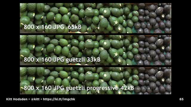
The guetzli encoded images aren’t visually any different, but they are considerably smaller.
original avocados-3200.jpg  760546
guetzli  avocados-3200.jpg  375394

resized  avocados-1600.jpg  231178
guetzli  avocados-1600.jpg  116378

resized  avocados-800.jpg   65150
webp     avocados-800.webp  41351
guetzli  avocados-800.jpg   33170
The downside is that, wow, does the encoding take a long time to run! The 3k image takes 7 minutes to run on my host, but on a first run, it improved my webpagetest score from an F to a C, so I’m doing something right!
The guetzli process doesn't produce progressive jpegs, however.

Progressive jpegs are listed as a performance booster on a number of performance websites (webpagetest and pagespeed), so we should consider it.

Baseline JPG images load from top to bottom. You might, depending on the size of your image, see it load this way.
Image credit: Book of Speed by Stoyan Stefanov - http://www.bookofspeed.com/chapter5.html

Progressive images load from blurry to sharp. You get a blurry image to start, and they sharpen up as the rest of the image is decoded.
Image credit: Book of Speed by Stoyan Stefanov - http://www.bookofspeed.com/chapter5.html
Again, as Progressive JPGs are listed on a number of performance tests as an improvement, not having progressive jpgs lowers our score.
But here’s the thing.
Our goal is a faster website. Our goal isn't a better performance test score.
Progressive JPGs aren’t always smaller. One of their improvements is that they are ofter smaller in size than a baseline JPG. Sometimes they are not.
As progressive JPG take longer to decode, increasing rendering time.
On the desktop with a modern browser and a faster internet connection, no big deal.
An old phone with an older browser and slower CPU and slower internet connect, MAYBE A BIG DEAL.
If you are optimizing for your web performance tool goal, you can add it with jpegtrans regardless of encoder, but doing so might increase the size of the file, and slows the decoding of the image on the client.
This is often one of those tradeoffs that, based on your users' devices, you will need to consider network time of delivering more bytes with the CPU time of decoding the images. Based on your customers and your tests.

That's our first pass of "deliver less" and "deliver faster"
But we have "render faster" too.
Depending on where you are in your performance improvement process, even small tweaks are going to help, including with the render faster part.

Render faster by including image sizes in the <img> tag. The browser can render the page faster if it doesn't have to recalculate the page layout. Using image size attributes tells the browser the size, there's no fitting, so rendering happens faster.
Don’t use inline styles, they are a pain to track down and cause much developer unhappiness.
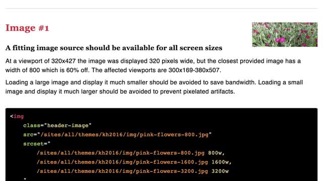
The img tag is great for single images, not so great for our resized images, so use the HTML5 with the srcset attribute and the picture element.

There are so many amazing guides, that I’m hurrying through these interesting things!

Not sure you’re doing it right?

Eric Portis just recently showed me how Martin Auswöger has my back. He has yours, too, with a responsive image linter.
respimagelint is a browser bookmarklet that checks images of a webpage for common mistakes done with responsive images. You save it to your browser's bookmarks, navigate to your site, click the bookmark, and see how you're doing!
A side note, the bookmarklet won’t work if you have your Content Security Policy (CSP) correctly in place, which you should, so run it on localhost or a locked down staging version of your site if you need to.

So, with resized images, choose the image sizes that fit with your designs, IF YOU CAN, don't let the client resize the images on the fly, the client resizing the images makes them look less good and increases the rendering time.
This is another tradeoff, but will affect the rendering times.

Continuing along, if we take our smaller files deliver faster, we realize the fastest delivery is no delivery, the fastest render is rendering nothing, which brings us to ...
Lazy Loading of images, the act of loading image and video assets when and only if they are needed.
Well, just before they are needed.

Load a placeholder image...

When the site visitor is scrolling down the page and hits a waypoint, before the image is about to come into view, trigger the final image load.
Medium, for example, is a well-known user of this technique.
Lazy loading isn't new, but it is far better supported than ever before.
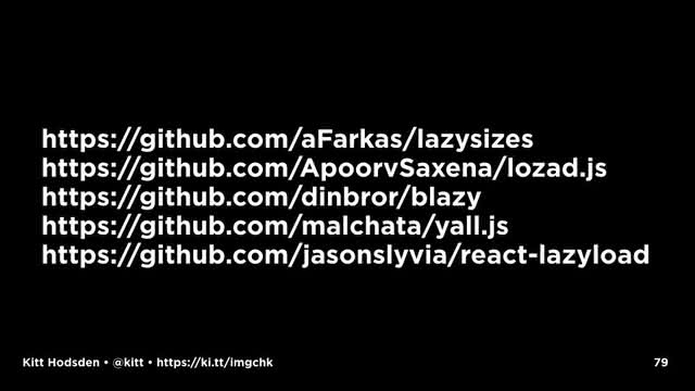
Because this technique works so well, we have libraries that will do the heavy lifting of this technique for us.
Yay!
Examples:
https://github.com/aFarkas/lazysizes
https://github.com/ApoorvSaxena/lozad.js
https://github.com/dinbror/blazy
https://github.com/malchata/yall.js
https://github.com/jasonslyvia/react-lazyload

And! We have the intersectionObserver event that we can use for scrolls and resizes!
You know, it wasn’t really that long ago that we could say, “no one resizes their browsers” and then the iPhone happened.
The intersectionObserver event gives the visibility and position of DOM elements relative to a containing element or to the top-level viewport.
It isn't fully supported in all browsers, but the lazy-loading libraries worth their salt use it when available, which is awesome.
https://developers.google.com/web/fundamentals/performance/lazy-loading-guidance/images-and-video/

Okay, those were the basics.
I hope this has all been review for you.

So, back to our goals:
Deliver less.
Deliver faster.
Render faster.
"Be like AMP"

As a front-end engineer, being like AMP means removing a lot of extra parts on a website, and this can be HARD.

Often times front-end engineers are at the end of a design and development cycle, and pushing back at this point is hard.
But we can do it.
Image credit: Shakes fist by Jason Eppink - https://www.flickr.com/photos/jasoneppink/325702373

We want to "Be Like AMP," which means make things light and fast!

Removing unused content (css, html, javascript) is pretty straight-forward.
There is removing whitespace, but also removing parts not used at all. Frameworks are the worst at adding "someone might need it someday" moving parts with CSS and Javascript, so diligence is needed to keep things clean!
Removing unused content includes removing unused images.

Images with a display:none style are still downloaded, that still affects your page download and rendering.
If you aren't going to display the image, don't load it.
If you aren't going to display the image immediately, defer loading it until all of the other assets are downloaded first.
Inline critical CSS, anything that is used to display the first page, include in the page, don’t wait for the browser to download the HTML, parse it, download the CSS, and THEN figure out it needs to download a background image.
There's that 14kB as the first network window of content. Put your critical CSS in that first request.

Profile third-party scripts, time them, too.

Remove duplicates. Do you really need the same thing twice?

Subset your fonts to reduce the file size. This means, remove characters you don't use.
Choose woff2 over woff.
And the fastest solution is not to use them at all if you can avoid them.

Web fonts that haven't been downloaded can't display (obviously). The browser can render the text in a known fallback font, then swap in the specified font once it has downloaded. Or, the browser can render all white, then display the words rendered in the web font once it finishes downloading.
To avoid the white screen then words, browsers are switching to the former style. We still have some control over the font display, however.
With font-display: fallback the browser has a small time window to download the webfont. When it is displayed, it is swapped in.
With font-display: optional the browser will check if the webfont is available. If it isn't, the browser will display the fallback font and won't swap in the webfont later when it finishes downloading. Subsequent pages, however, will have the webfont if it is in the site's browser cache.

After image resizing, and webfont removal, this is the third-most effective performance optimization you can do: delayed loading of assets with async. With images, we do this with lazy loading.
But what about images that we don’t want to lazy load, or those webfonts the ones we KNOW we need for that first render?

Oh boy, that’s where service workers and ...

... resource hints come in. I love these.

I'll start with the resource hints. These are prefetch, preload, dns-prefetch, and preconnect.

Prefetch lets you fetch low-priority resources that you don't need currently, but will on a page or navigation change. So, not the current page, but the next page.
If you strongly optimize your home page, which you should do if that's where most people first see your website, and need more resources for subsequent pages, prefetch is great. For known or very common paths through an app, we can prefetch assets we don't need right away, but are confident we'll need shortly.
If a first-time visitor lands on the home page, she will likely also view the about or pricing page, whereas a repeat visitor might go for the login.
When logging in, we know where we will likely redirect the user, so loading those assets on the authentication page gives us a chance to increase perceived performance.
Predicting where users will go is difficult, but if you know, then prefetch is great.

Also great is dns-prefetch if you know you are going to load assets from a domain you haven't loaded yet, get the DNS information already in the client's cache, use dns-prefetch.
My domain lookups from India take between a ½ and a full second, and these lookup times are outside of my control. Improving that look up time by removing it all together? GREAT.

For page assets on the current page, preload is available for resources that aren't immediately discovered, but are needed.
This is a way for the developer to declare assets that need to be loaded sooner than later, giving the developer a little more control over the client's asset prioritization.

So, for example, webfonts are retrieved after the CSS has been downloaded and parsed. You kinda know you're going to need them, so go can go ahead and tell the page that they're coming.
A nice thing about the preload link is that it loads assets without blocking or delaying the page's onload event. And it triggers its own onload event, however, giving us a chance to react to the resource.
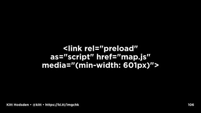
With the preload link, the media attribute is available, which allows us to customize what we load, and adjusting for screen width, device type, or other such CSS media queries we have in our design.

Yoav, who is up later, gives a wonderful example of the case where the desktop version of a navigation web app might return an interactive map, whereas the mobile version might display only a static image. Preload with media attributes let's us specify which one to load.

Again, preload means these files are downloaded, even if not used, so careful with webfonts that you send the right ones, or the incorrect ones could be downloaded in the link preload, and then the correct ones will be downloaded from the css.
It also changes the priorities, so another asset's loading will be deferred. You don't magically get more bandwidth with this.

And with preload we can mess things up. Like seriously. With great power comes great responsibility!
There's only so much bandwidth the user has, and there's a limit to the number of connections that a client will make to the server, so specifying preload assets means that those will be prioritized first, at the cost of something else.
Also don’t use “prefetch” and “preload” for the same files: They are used for different purposes and frequently cause double fetches. Use preload if it’s supported for warming the cache for current sessions otherwise prefetch for future sessions. Don’t use one in place of the other.
Another way to preload known assets is to use service workers. I am so excited about service workers, though more for the caching and offline abilities than for performance reasons. They are still really awesome.
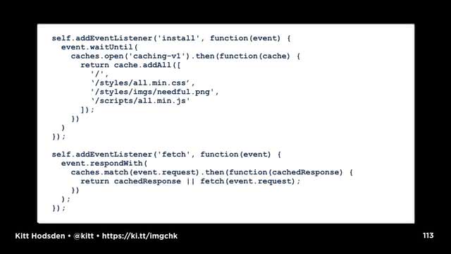
When a browser first loads a page, it has one javascript process, one thread, that has to handle all that javascript loaded into the page. A service worker is a secondary JavaScript process that runs along side that single JavaScript process, giving us a way to handle some of that load, freeing up the original main thread for user interactions. As it runs in the global space, it isn't tied to a particular page. We can use these service workers for tasks like delayed or slow asset fetching or lengthy calculations can increase both perceived and actual performance on a page.
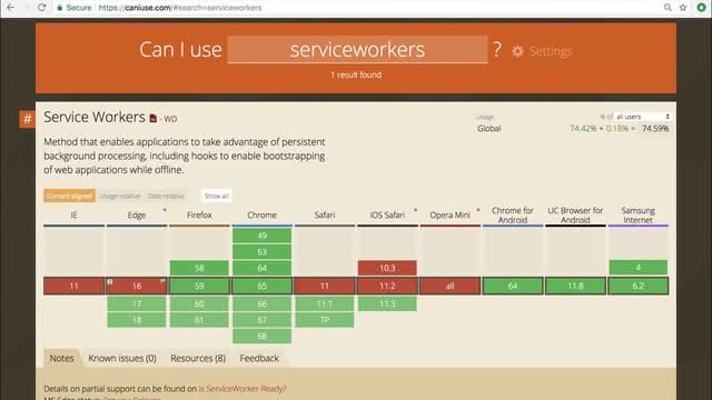
Support for service workers is universal for all modern browsers, and near universal for only slightly older ones.
This slide is out of date, service workers are now supported on the latest iOS Safari version.

Be like AMP here means we can use service workers to load assets, but we need to be wary of the performance hits.
Service workers are great, but like many silver bullets, I mean new technology, they don't always hit their mark. Don't cache too much and delay the service worker registration, lest the registration stall while things are fetched.
By delaying the ServiceWorker registration until we’ve finished loading extra API requests, CSS and image assets, a page can finish rendering, then we can start pulling in extra page to finish rendering.
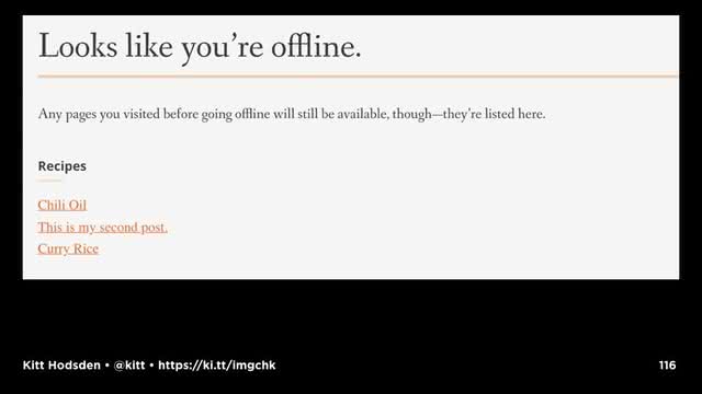
Bonus, our site works offline! None of this "can't reach server" when, well, the client isn't online.
Site credit: https://wiltomakesfood.com/

Was that the most efficient use of our optimizing time, given how difficult affecting change is at the end of the development process?

With Souders Performance Golden Rule, "80-90% of the end-user response time is spent on the frontend, start there," one might say, all the performance work should be by the front-end developers. And that's mostly true, but that's mostly true for application work with the javascript and css.
But we're talking about images, which are in the area of the back-end engineer. Often times, front-end work blends with back-end work, and other times we have an idea where the separation is between the two, and then we go to a different company and the separation is in another location.
So, despite the blurry border, the back-end engineer can still affect a site's performance. Some things to keep in mind, for example, is the most obvious:

Don't do anything but deliver the images.
Don't resize in real time. Instead push the processing off to another process or server.
Don't ever make the user wait for image processing. Instead, deliver a placeholder while the image processing is being done.
Don't encode, decode, convert file types, or transform an image while the user is waiting.

You might be asking, "Who does that?"
Nearly all...

... modern ...
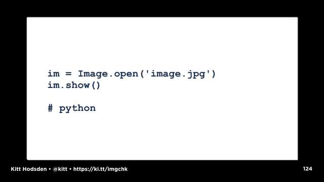
... programming languages have the functionality to do image manipulation, because it’s fun, it’s interesting.
And It’s not something a user wants to wait for.
For a command line application, or a dedicated non-UI apps, great!
Not with the user.

If you have a process that needs to do something with your images before sending it along to the user, give them a placeholder until the process is done.
If resizing user submitted images is a task for your site, optimize for that user's experience (resize with whatever process is fast), but come back around to optimize those images in your processes. That guetzli encoding is going to take minutes to do. Imagemagick convert to resize the image, serve it fast, then come back around to squishing it and making it smaller.
Recall, we want to offload any long process we can. Async all the things!

Sometimes we have the case that certain images aren't for public consumption, they are viewable only when authenticated. For permission based image access, profile and optimize the controllers. Make that permissions check super fast.

Cache everything, cache for the longest you possibly can.
This is how Google makes AMP requests fast. It isn't by having less stuff on the page, though that helps, it is from caching the crap out of those AMP pages. Google has a caching layer close to you, can preload those AMP requests, and deliver to you so that you think WOW! The secret sauce is caching.
Images on archive content likely aren't going to change, for example, so ...

... go ahead and use those Expires headers to expire next decade at least.
Even something small is going to help by not downloading the next time.

Logos likely aren't going to change, and if they do change, you can use a different file name than logo.png for the new one.
Okay, kidding on that naming scheme.
But, really, images in older or archived content aren't likely to change after the content grows stale. That length is definitely based on a site's mission. Craigslist images can expire in a week in San Francisco, but a month in some parts of Indiana. The Expires header is your friend.

The front-end references to dns-prefetch ?
TOTALLY relevant here.
As is preconnect.

preconnect is another resource hint that suggests to clients that they set up early connections before an HTTP request is sent to the server.
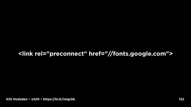
This includes the DNS looksups, TLS negotiations, and TCP handshakes. This reduces roundtrip latency, saving time for the user.
Why mention it here, with the back-end developer? Instead of the front-end part?

So that I can also mention that preconnect, like dns-prefetch, can be requested in Headers, which is more likely on the backend developers plate than the front end, but that line is often blurred.
When sending as a Header, the page HTML doesn't need to be changed, we don't need to edit the HTML, we can test these changes from a different place in the stack.

And this is true for all the resource hints, they can all be sent as Headers:

Be Like AMP: "Solve problems on the right layer." depending on the site, the backend might be the right place to call for preconnect

Another thing we want to do is eliminate known 404s.
You can't eliminate all the 404s, people type things in, people check things out, they poke around, but you can remove all of the bad links from your website, and, when resources are moved, handle them gracefully with 301 redirects.
That Be Like Amp? One of those is don't break the web. Deliberately choosing to create 404s or not handling known ones is a form of breaking the web. Don't do that.
My saying use redirects just now makes my saying minimize redirects somewhat ironic.
Still, minimize redirects.
This might mean rewriting URLs in current pages, in current content, or it might mean updating your configurations.
And example, don’t mix https and http, go all ssl.

Have you seen this? You type in a domain, and then redirected to the https:// version, which is redirected to the secure www host, which includes insecure assets.
Go straight from http://example.com to https://www.example.com, don't mess around with those host names.
Remove the mixed protocol content on pages.
Again, this might mean rewriting content on your current pages. Regular expressions and configuration files FTW.
Again, our goals here are deliver less, deliver faster, render faster, be like AMP.

Push what you can to a CDN. CDNs are in the business of doing the server optimization for faster asset delivery.

Server tuning plays large a role in the efficiency of the delivery, which is where devops and system administration are important.
There are sooooo many server optimizations that can be done, and many are specific to the technologies used by the site. This is a topic that I could likely talk about for days. I believe I can sum up this topic really succinctly for most commercial projects.
For image assets ...
Use a CDN
Of note, my joke here fell completely flat. I think everyone was sleeping. Or it wasn't a good joke. Likely the latter.

The problem with that solution is that not all sites or projects are in a position to afford one: lack of money, lack of time, lack of expertise, sometimes even a lack of awareness.
So, if your project is one of these, a few guidelines to optimize your server configuration.
First up, switch to HTTP/2, which requires SSL.
I would like to believe that everyone has switched over, certainly all the big companies have, but not all the sites are on the big companies' servers!
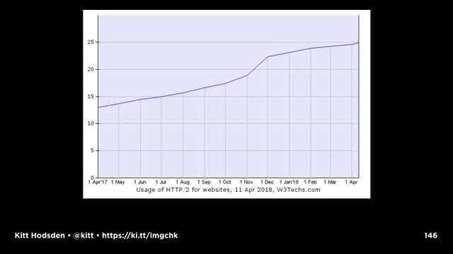
My search for statistics on HTTP/2 yields numbers around a quarter of the internet has upgraded. But that’s okay, it’s better than zero!

Why HTTP/2?
Binary protocol, easier to parse, smaller on compression. Previous versions are text based.

Multiplexed, allowing multiple requests and response messages to be in flight at the same time; it’s even possible to intermingle parts of one message with another on the wire. This, in turn, allows a client to use just one connection per origin to load a page.
With HTTP/2, we don't need to shard our domains in order to increase download speeds by increasing the number of domains we can multiplex with. This is great, simplifies our server topography, fewer moving parts "Solve problems right layer"
Remember the sprites that I mentioned earlier? With HTTP/2, maybe I don't need sprites, since the connection isn't closed, and I can keep going. See, this is the PERFECT experiment to run.
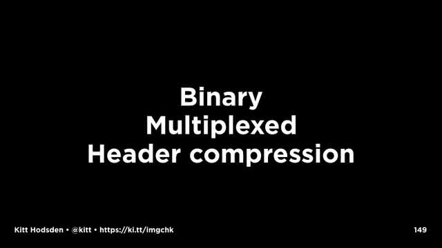
Headers with cookies and referrers and the like can sometimes require 7-8 round trips to get the headers out, not including response time - that’s just to get them out of the client. TCP requires acknowledgement of those network packets, so there’s another slowdown. With the binary we can compress, and with the compression we have smaller overhead. On mobile, the benefit is increased.
So switch to HTTP/2

This is a requirement for HTTP/2, which is great, I'm a huge fan of SSL.
But sometimes switching over is difficult, especially for smaller sites without a dedicated team. Actually, even for some larger sites WITH a dedicated team this is difficult.

Start with Let’s Encrypt which provides a script that will create an SSL certificate and adjust your server configuration for you.
That script part? DevOps? Yep! Automate it!

Don't do SSL on a shared host without dedicated IP address.
Don't mix protocols. Embrace the SSL.
Turn on compression. I would like to believe everyone has done this, but I know from experience in even the last year, that turning on gzip on a server is an aha moment for a number of companies.

Talking specifically about images, tune the server for static content. It is okay to have servers for just static content, and others for dynamic. This is the one of the features of a CDN, tuning the static and dynamic servers separately.

Clean up your servers.
Turn off unused modules and features. This one is obvious and often overlooked. Do you need X11 on your webserver? No. Do you need mod_perl on your asset web server? No, you don't. Spend some time undoing the experiments and leftover configurations that aren't used.

Cache everything, from sending the right headers to the browsers to caching content and pages in memory for faster access.
Again, THIS is how AMP pages are so fast with Google, they preload AMP pages in their caching servers, bypassing the content origin. This is great for inspiring speed, and fantastic and creating controversy.

Break your own stuff before something else does.
Here is the reality of the web: the question is not IF something will break, the question is WHEN something will break.
That breaking can be your site via someone internally accidentally or someone external maliciously. Or it can be someone internally deliberately turning off layers, discovering what happens, and developing a more resilient infrastructure.
Having recovery processes in place is crucial to your site’s assets performance. So, break your site on purpose, and see what happens.
This includes your database, your caching layer, the web server. Turn off one server, what happens? How do you recover?

So, those are the basics of things to do server side.

And again, CDNs do all of this with grace, style, and speed.
Some of them are really good at it.
Check your site before and after a change.
Not every change is going to be worthwhile.
I was really excited about a preload change I made, and all my post-change tests indicated that, nope, the browser knows better than I do with the prioritizing of that asset. I undid that change.

And automate all of this.
You knew I was going to say that.

And finally, as a designer, content strategist, seo admin, site architect, or business development...
... embrace less.
We can just put less on the site, and that's okay.

Do we need the 23 trackers that CNN has?
What does that 23rd tracker have that the others 22 don't provide?
Get one of those other third parties to implement that feature you need.

So, after that mad dash through those different techniques and technologies, which are the most impactful to image performance?
What is on our "I'm already resizing images, what should I do next?" list for increasing website performance - images in particular.

Recalling our goals ...

You can make the biggest impact in your images by
1. Resizing images.

2. Making the images as small as possible
Optimize images
Use an efficient encoder
Remove EXIF
Lower the image quality, especially for smaller sizes
Choose the best format (read smallest size) for the image subject and destination (client).
Art direct smaller images for smaller screens
AUTOMATE IT.

Use Resource hints
Front end with link elements, back end with Headers, both with testing!

Use a CDN.
If you can't, tune servers delivering assets to deliver fast:
Enable compression
Use HTTP/2
SSL all the things

In the end, be inspired by your competitors
Because in reality, you’re already doing really well, you’re here.

If all of this was review, You are doing images right!
You are awesome!

Thanks for reading!
If you want to talk about this presentation, have questions, or want to send feedback, contact me.